Interactive Design | Exercise 1: Web Analysis
23/4/25 - 30/4/25 (Week 1 - Week 2)
Kimberly Miaw Jya Nee | 0366836
Bachelor of Design (Honours) in Creative Media | Taylor's University
Interactive Design
Exercise 1: Web Analysis (10%)
[Table of Contents]
1. Instructions2. Exercise
3. Feedback
4. Reflection
[Instructions]
[Exercise]
For our first exercise, we were required to analyze 5 existing websites
and identify areas of strengths / weaknesses in terms of:
- Purpose and goals of the website (evaluate whether they are effectively communicated to the user)
- Visual design and layout of the website (use of colour, typography, and imagery)
- Functionality and usability of the website (navigation, forms, and interactive elements)
- Quality and relevance of the website's content (accuracy, clarity, and organization)
- Website's performance (load times, responsiveness, and compatibility with different devices and browsers)
Process Work
1. RAYRAY CREATIVE WEB LAB by RAYRAYlab

Fig. 1. RAYRAYlab Main Page
Purpose & Goal
RAYRAYlab is a one-person creative agency from Korea that specialises
in interaction design, web development, branding, and
planning.
Their goal is to help brands express their stories in a
multidimensional way by adding three-dimensional elements to a
two-dimensional space, which creates a sense of depth and futuristic
design. This also enhances how brand values and stories are delivered.
They aim to leave a lasting impression through engaging, impactful,
and distinctive digital experiences.
Visual Design & Layout

The website uses a monochrome palette of black, white, and grey that creates a clean, futuristic, almost science lab-like feel. This is paired with subtle 3D elements in the background. Colour only appears in high-quality images of their featured work, which is revealed through a scroll-triggered “cover” animation. The site uses mostly sans-serif fonts with some digital-style typefaces, which adds to the tech-forward vibe. The layout is clear and intentional, as they guide users through the brand’s mission with smooth, unique animations that add to the experience.
Functionality & Usability
The website is easy to navigate, with a single-page layout that invites users to scroll by using small captions like “please scroll down” that gently guide the experience. All main buttons are fixed at the top and stay accessible at all times. The background elements respond slightly to cursor movement, which adds a subtle interactive layer without distracting viewers from the content.
Quality & Relevance
The website clearly communicates what services they offer, along with their purpose and goals. Their expertise is supported by awards and recognitions displayed on the homepage. The content is well organized that guides visitors through each stage of their process. Their contact information is placed at the end but is also easily accessible through the top menu. However, I did notice one or two minor spelling errors while browsing the site.
Performance

Fig. 3. Mobile Version of RAYRAYlab Website
The website loads quickly, with high quality images appearing almost instantly. Buttons respond well, and cursor based movements are smooth and sensitive. It works across different browsers and devices, but most of the transitional animations don’t appear on mobile. This makes the mobile experience feel less immersive compared to the desktop version.
Strengths & Weaknesses
Strengths:- Strong and consistent visual identity
- Smooth, unique animations that enhance experience
- Clear structure and easy navigation
- High quality images and responsive elements
- Effectively communicates purpose and services
Weaknesses:


- Minor spelling errors found on the site
- Some animations don’t appear on mobile, which makes the experience feel less immersive
2. David Whyte Experience by Immersive Garden

Fig. 4 David Whyte Experience Page
Purpose & Goal
David Whyte is a poet, philosopher, and speaker whose work gives voice to the deep sources of human identity, human striving, and the possibilities for happiness.
The website showcases his work, offers an online store for his books, and shares updates on tours and events. It also includes monthly subscriptions to his latest writings, and a yearly subscription to an online archive of talks, films, and a lifetime of work.
The most unique feature is the Experience page, an interactive space where his writings are paired with immersive, diorama-like visuals that bring the words to life.
Visual Design & Layout

Fig. 5. Quick Scroll Through of the David Whyte Experience Page
The website uses a neutral, earthy colour palette throughout, which creates a calm and grounded feel. The serif fonts adds a thoughtful, literary touch that matches David Whyte’s brand and identity well. Most of the imagery includes nature scenes and behind-the-scenes photos of David at work, which gives the site a serene, collected atmosphere and offers visitors a quiet glimpse into his creative process.
The Experience page stands out in the website. It is like a digital diorama or pop-up book. As visitors scroll, interactive watercolour landscapes unfold, and they can “open” the scenes by brushing their cursor across blank watercolour pages.
The layout is clear and straightforward, with simple scrolling and smooth, subtle animations that keep the experience gentle and focused.
Functionality & Usability

Fig. 6. Top Bar of the David Whyte Website
The website is easy to navigate with a top bar linking to all key sections, for example the Experience page, Poetry & Prose, Walking Tours, Speaking, Web store. These are also shown on the homepage as users scroll, but the menu is helpful for direct access. The store and subscription pages are simple and easy to use. The Experience page adds an exciting, interactive touch where users can “reveal” scenes with their cursor.
Quality & Relevance
The information on the website is accurate and clearly presented, with each section explained in a concise, easy-to-read way. It’s well organised, and sections like events, store, and portfolio are easy to understand at a glance, with no confusing labels or clutter. The Experience page stands out by making his work more engaging. It includes small captions that guide visitors to scroll or "open the landscape," which invites deeper interaction without being overwhelming.
Performance
The website loads quickly, with high resolution images appearing seamlessly as visitors scroll. The scrolling transitions smoothly between sections, so visitors don’t need to align anything. All buttons are responsive, and while the Experience portal takes a few seconds to load, it’s understandable given its interactive nature.

Fig. 7. Mobile Version of David Whyte Experience Page
The website is compatible across different browsers and devices. However, the mobile version of the Experience portal has more text space, which limits the visibility of the diorama background compared to the desktop view. It also does not have the interactive watercolour feature. Despite this, the smooth scrolling animation remain intact.
Strengths & Weaknesses
Strengths:- The website is visually appealing and engaging, with a clean, organised layout that highlights key content
- The interactive elements, especially the Experience page, provide a unique and immersive experience
- Navigation is clear, and the website is responsive across devices, with smooth transitions
- The mobile version of the Experience portal limits the full view of the diorama background
- The mobile version of the Experience portal does not include the interactive features available on the desktop version
3. Alec Tear by noko

Fig. 8. Alec Tear's Website Home Page
Purpose & Goal
Alec Tear is a British designer and lettering artist with a strong background in brand identity and packaging design. He combines conceptual thinking with a deep love for typography to create bold, original work for brands worldwide. His website serves as a portfolio that showcases his creative process, signature style, and past collaborations. This gives visitors a clear sense of his design process and expertise.
Visual Design & Layout

Fig. 9. Quick Scroll Through of the Website
The homepage is immediately striking with its bold use of ultramarine blue as the background, contrasted by clean white text. This vivid colour pairing grabs attention and reflects a confident, energetic tone. All text appears in lowercase, which adds a casual, carefree personality to the site. The typography features extended serif and sans serif typefaces that bring a playful, distinctive character. His portfolio pieces are displayed creatively. When hovered over, the images shift to reveal their original colours and finer details. Overall, the site feels dynamic and interactive,. It invites visitors to actively engage with the work rather than passively scroll.
Functionality & Usability
The website is simple and intuitive to navigate. Upon landing on the homepage, visitors are immediately presented with two large, clear buttons, one leading to the design portfolio and the other to the lettering section. This direct approach helps users explore Alec Tear’s work without confusion. The site’s interactive elements, like hover effects on portfolio pieces, enhance engagement without overwhelming the browsing experience.
Quality & Relevance

Fig. 10. Information Section of The Website
All information is presented clearly and in an organized manner. Each section is marked with clear buttons, and the text is neatly arranged in columns, which makes it easier for visitors to read and navigate without feeling overwhelmed.
Performance

Fig. 11. Mobile Version of Alec Tear Website
The website loads very quickly and is highly responsive, especially with its many hover based animations and cursor interactions. It works well across different browsers. On mobile, while hover effects are reduced, the layout and information remain clean and accessible.
Strengths & Weaknesses
Strengths:- Bold colour scheme that grabs attention
- Playful typography with a mix of serif / sans serif and selective lowercase use that adds personality
- Interactive hover effects that make the portfolio feel lively and engaging
- Clear structure with easy navigation between design and lettering sections
- Some interactive elements like hover effects don’t work on mobile, which slightly limits the experience
- The project pages could benefit from short descriptions or insights into the creative process, as they currently only show the title, award, client, and credits
4. Alpine Bio by Resn

Fig. 12. Alpine Bio Main Page
Purpose & Goal
Alpine Bio is a biofactory that programs seeds to produce functional proteins. Using a simple genetic code, each seed becomes part of a scalable bio-manufacturing system. Their goal is to support farmers and the agricultural sector by increasing profitability and promoting sustainable farming through the use of existing farmland.
Visual Design & Layout

Fig. 13. Quick Scroll Through of Alpine Bio Website Homepage
The website maintains a clean white theme, allowing most of the colour to come from the high quality background images. The typography stands out with a custom font made of tiny circles arranged to resemble molecules, which ties in well with their identity as a biofactory. The imagery also follows this molecular concept, which uses close up visuals framed in connected circles. This creates a unique and engaging scroll experience, where the images seem to “bubble” into view as visitors move through the page. There aren’t many interactive elements, but the site makes up for it with dynamic visuals and well integrated diagrams that keep the experience engaging.
Functionality & Usability
This website is simple and straightforward to navigate. Visitors can scroll down to explore the main content, and additional buttons at the bottom lead to more detailed explanations for each topic. These sections are also accessible through the menu button on the top right corner which makes it easy to jump to specific areas. The buttons include a basic hover effect for visual feedback.
Quality & Relevance
The website clearly explains each step of the process in simple, concise language. This makes it accessible for visitors who may not be familiar with the concept. It also includes dedicated sections that offer more detailed explanations of their services that allow users to dive deeper if needed. The content is well organized into bite-sized pieces. This ensures visitors can easily grasp the concepts without feeling overwhelmed.
Performance

Fig. 14. Mobile Version of Alpine Bio Website
The website loads within a couple of seconds for most pages, and the transition animations of the images appearing into view blend seamlessly with the loading process. All buttons are responsive with a simple click. The mobile version of the site maintains the same, consistent design and functionality as the desktop version.
Strengths & Weaknesses
Strengths:- The website offers a clean and simple layout that is easy to navigate and understand.
- High quality imagery and smooth transitions enhance user experience.
- Brand identity is reinforced by the molecular theme that is creatively integrated into both typography and visuals.
- While the website is informative, it could benefit from including client testimonials to build credibility.
- A dedicated page outlining the full range of services they provide would give visitors a clearer understanding of their services.
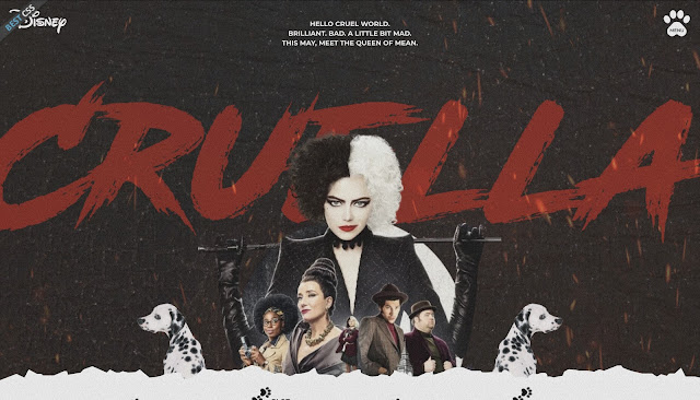
5. Cruella De Vill by Daria Ziablikova (DZ DESIGN)

Fig. 15. Cruella Main Page
Purpose & Goal
Cruella is a 2021 American crime comedy film based on Dodie Smith's 1956 novel The Hundred and One Dalmatians. It serves as a backstory and an alternate origin story for its antagonist, Cruella de Vil (Wikipedia, n.d.).
This website was designed by Daria Ziablikova as part of a training course led by Ania Melnik. It introduces the story of Cruella in an interactive website format that offers a short summary of the film's plot through engaging visuals and strong design elements.
Visual Design & Layout

Fig. 16. Quick Scroll Through of Cruella Website
The website uses a scrapbook style that fits the bold and rebellious vibe of Cruella. It sticks to the brand’s colours: red, black, and white. For text, it mainly uses two fonts: a smeared paint-like font for titles that adds drama, and a simple sans serif font for the descriptions so it’s easy to read. The images on the site aren’t very sharp and look a bit dull in colour, which might be a stylistic choice to match the rough, vintage feel. Each image also has a grainy animation that moves slightly, which adds texture and keeps things from feeling too flat. As you scroll, transitions and animations make the page feel more dynamic and interesting.
Functionality & Usability
This website is a single-page design, so visitors only need to scroll down to see all the content without worrying about missing anything. There’s also a menu button in the top right corner that lets users quickly jump to specific sections. The visuals throughout the page are animated, and the background features transitions as visitors scroll. However, the site doesn’t include any interactive elements, so while it’s visually engaging, there’s limited user interaction beyond scrolling and navigating with the menu.
Quality & Relevance
All the information on the website is well organised, starting with background details, followed by a summary of the story, and then extra details such as the movie’s budget, worldwide gross, and runtime. Each section is clearly separated which makes it easy to follow. One small but thoughtful feature is the scroll progress bar at the top of the page. It helps users keep track of how far they’ve scrolled through the content.
Performance
There is a slight delay when first entering the website, and I noticed that the images load quite slowly, especially in the cast section, where some only appeared after I had already scrolled past. The transitions also feel a bit rushed and not as smooth as expected, which affects the overall flow. Despite these issues, the buttons are responsive and work as they should. The mobile version of the site is also well-optimised, maintaining the same layout and design consistency as the desktop view.
Strengths & Weaknesses
Strengths:- Clear single-page layout with smooth navigation
- Consistent use of brand colours and fonts
- Scroll progress bar enhances user experience
- Slow image loading (especially in the cast section)
- Transitions can feel rushed or not very smooth
- Slight delay when first entering the site
[Feedback]
Week 1 (23/4/25)
General Feedback:
Module + Exercises / Projects briefing during class. We begin to search
for websites for Exercise 1 and Project 1 for sir to approve before
proceeding.
Specific Feedback:
I have chosen 5 different kinds of websites and began the analysis for
each websites.
Week 2 (30/4/25)
General Feedback:
[Submission Week] This week, I finished up the remaining website analysis and also polish up the blog for submission.
Specific Feedback:
[Absent for class this week]
[Reflection]
Experience
Overall, this exercise was quite straightforward but also time consuming. I spent a lot of time analysing each part of the website carefully. It helped me understand how a website works and what makes it good in terms of design and user experience. But it was interesting to explore the variety of websites, and seeing them has been inspiring. Like I always say, it’s a great addition to my visual library.
Observation
Small details make a big difference in a website. Things like how fast it loads, how smooth the transitions are, and how the content is organised all affect how people feel when using it. If done well, users can find what they need easily and enjoy the experience.
Findings
Balance between design and function is key to making a website both visually appealing and easy to navigate.
Thank You
