Advanced Typography | Task 2: Key Artwork & Collateral
13/5/25 - 27/4/25 (Week 4 - Week 6)
Kimberly Miaw Jya Nee | 0366836
Bachelor of Design (Honours) in Creative Media | Taylor's University
Advanced Typography
Task 2: Key Artwork & Collateral (30%)
[Table of Contents]
1. Lectures
2. Instructions
3. Task
4. Feedback
5. Reflection
7. Quick Links
[Lectures]
AdTypo_5_PerceptionAndOrganisation
Advanced Typography: Perception & Organisation
Perception in typography deals with the visual navigation and
interpretation of the reader via contrast, form and organisation of the
content. Content can be textual, visual, graphical or in the form of
colour.
7 Kinds of Contrast
1. Size
- Provides a point to which the reader's attention is drawn
- Most common use of size is in making the title / heading noticeably bigger than the body text
2. Weight
- Describes how bold type can stand out in the middle of lighter type in the same style
- Using rules, spots, squares also provide a "heavy area" for a powerful point of visual attraction / emphasis
3. Form
- The distinction between a capital letter and its lowercase equivalent / roman letter / italic variant / condensed / expanded version
4. Structure
- The different letterforms of different kinds of typefaces
- Example: a monoline san serif & a traditional san serif, an italic & a blackletter
5. Texture
- Refers to the way the lines of type look as a whole up close & from a distance
- By putting together the contrasts of size, weight, form, structure & applying them to a block of text on a page
- Depends partly on the letterforms themselves & how they're arranged
6. Colour
- The use of colour is suggested that a second colour is often less emphatic in values than plain black on white
- Therefore it is important to give thought to which element needs to be emphasized and to pay attention to the tonal values of the colours that are used
7. Direction
- The opposition between vertical & horizontal, the angles in between
- Turning one word on its side can have a dramatic effect on a layout
- Text blocks also have their vertical / horizontal aspects of direction
- Mixing wide blocks of long lines with tall columns of short line can also create a contrast
Form
- Refers to the overall look and feel of the elements that make up the typographic composition
- Plays a role in visual impact and first impressions
- A good form in typography tends to be visually intriguing to the eye; it leads the eye from point to point, it entertains the mind & is most often memorable
- Originating from the Greek words "typos" (form) & "graphis"(writing)
- Typography means to write in accordance with form
Typography can be seen as having two functions:
1. to represent a concept
2. to do so in a visual form.
2. to do so in a visual form.
Displaying type as a form provides a sense of letterforms' unique
characteristics and abstract presentation.
Organization & Gestalt
- Gestalt: german word of the way a thing has been "placed" / "put together"
- Gestalt Psychology is an attempt to understand the laws behind the ability to acquire & maintain meaningful perceptions
- Emphasises that the whole of anything is greater than its parts
- Based on the idea that we experience things as unified whole: Instead of breaking down thoughts and behaviour to their smallest elements, the gestalt psychologists believed that you must look at the whole of experience
- Therefore in design (read: typographic layouts), the components / elements that make up the design is only as good as its overall visual form
- While each component may be functional at an elemental level, the sum of its parts is not greater than the whole or the overall form
1. Law of Similarity
2. Law of Proximity
3. Law of Closure
4. Law of (Good) Continuation
5. Law of Symmetry
6. Law of Simplicity (Praganz)
[Instructions]
[Task]
In this task, we were required to create a wordmark / lettering
that is also an artwork using our first name or a pseudonym. I have
decided to use my full first name "Kimberly".
Task 2(a): Key Artwork (10%)
Research

Fig. 1. Wordmark / Lettering Inspiration from Pinterest (Week
4)
I started by looking at inspiration on Pinterest to get a better
idea of what a good wordmark looks like and to figure out what kind
of styles I naturally gravitate towards.

Fig. 2. Wordmark / Lettering Inspiration from Cosmos (Week
6)
I made another moodboard after Week 5's class, to further explore my
wordmark.
Ideation

I made a mind map about myself, based on my personality, interests,
strengths and weaknesses, and the mottos I currently live by. This helped
me reflect on who I am and what I want to express through my
wordmark.

Fig. 4. Sketch - First Try Before Feedback (Week 5)
Above are the initial sketches for my wordmark. I explored two main
concepts: one that was nature-inspired, flowy, and free; and another
that was more structured and geometric. During class (Week 5), Mr. Vinod
suggested I continue to explore and refine my wordmarks, such as add
more details or make it more minimal. He asked which sketch I liked the
best, so I told him the first two from the top were my favourite. I
decided to proceed with these two options moving forward.

Fig. 5. Sketch - After Feedback (Week 6)
To avoid wasting time, I decided to focus on the first concept:
nature-inspired, flowy, and free. I’ve always appreciated the details
found in nature, so I looked up more in-depth inspiration images (Figure
2) and sketched a few variations.
After finalising each letter, I found that the letter Y was a bit
tricky to keep consistent with the rest. It looked slightly
disconnected, especially when placed next to the letter L. Eventually, I
managed to come up with the best option (starred).

I transported my sketch into Illustrator and began digitising my
wordmark using the Pen Tool and Curvature Tool. I also turned on the
grid to help maintain consistency, this makes sure each letter fits
within the 3x3 box structure.

Fig. 7. Top Wordmark: Not Rounded, Bottom Wordmark: Rounded
(Week 6)
I experimented with slightly rounding the corners of the letters
by 5px to see if it would add a softer, more organic feel.
However, I found that the clean, sharp edges better suited the
overall look of the wordmark. It keeps it crisp and consistent
with the structured flow I was aiming for.

Fig. 8. Final Digitalised Wordmark (Week 6)
Colour Application
Next part of the this task is choosing a colour palette. I
chose two similar earthy colour palettes from Color Hunt and mix and matched the shades to create a more balanced
combination. The soft greens, warm browns, and muted coral give a grounded,
natural feel that I aim to express.

Fig. 9. Chosen Colour Palette
Once I settled on the colour palette, I started experimenting with
how the colours looked on my wordmark.

Fig. 10. Colour Palette Exploration / Testing on My
Wordmark
GIF Animation
We were also required to create a GIF animation of our wordmark, which
I animated in After Effects. The concept behind my animated wordmark
is a stretch kinetic motion paired with a slit-scan effect. I followed
a
Youtube Tutorial Video by PANTER.

Fig. 11. Animation Progress in After Effects
[Accidentally permanently deleted the original wordmark file in my
laptop...]
After animating it in After Effects, I converted the MP4 video into a
GIF.
Final Compilation for Task 2(a)

Fig. 12. Black Wordmark on White Background (JPEG)

Fig. 13. White Wordmark on Black Background (JPEG)

Fig. 14. Colour Palette (JPEG)

Fig. 15. Wordmark in Actual Colours on Lightest Shade of Colour
Palette (JPEG)

Fig. 17. Final Key Artwork Compilation (PDF)
Fig. 18. Wordmark Animation (GIF)
Task 2(b): Collateral (20%)
In the second part of this task, we were required to:
- Create a pattern or design elements using the wordmark, or ones that complement it.
- Apply our wordmark and any accompanying patterns / logos onto 3 mockups to visually present the final design.
- Create an Instagram account to showcase key artwork & collateral (1080 x 1350 px)
Research

Ideation
Monogram
To start, I created a monogram using the letter 'K' from my
wordmark. I experimented with different arrangements to see
which arrangement looked best.
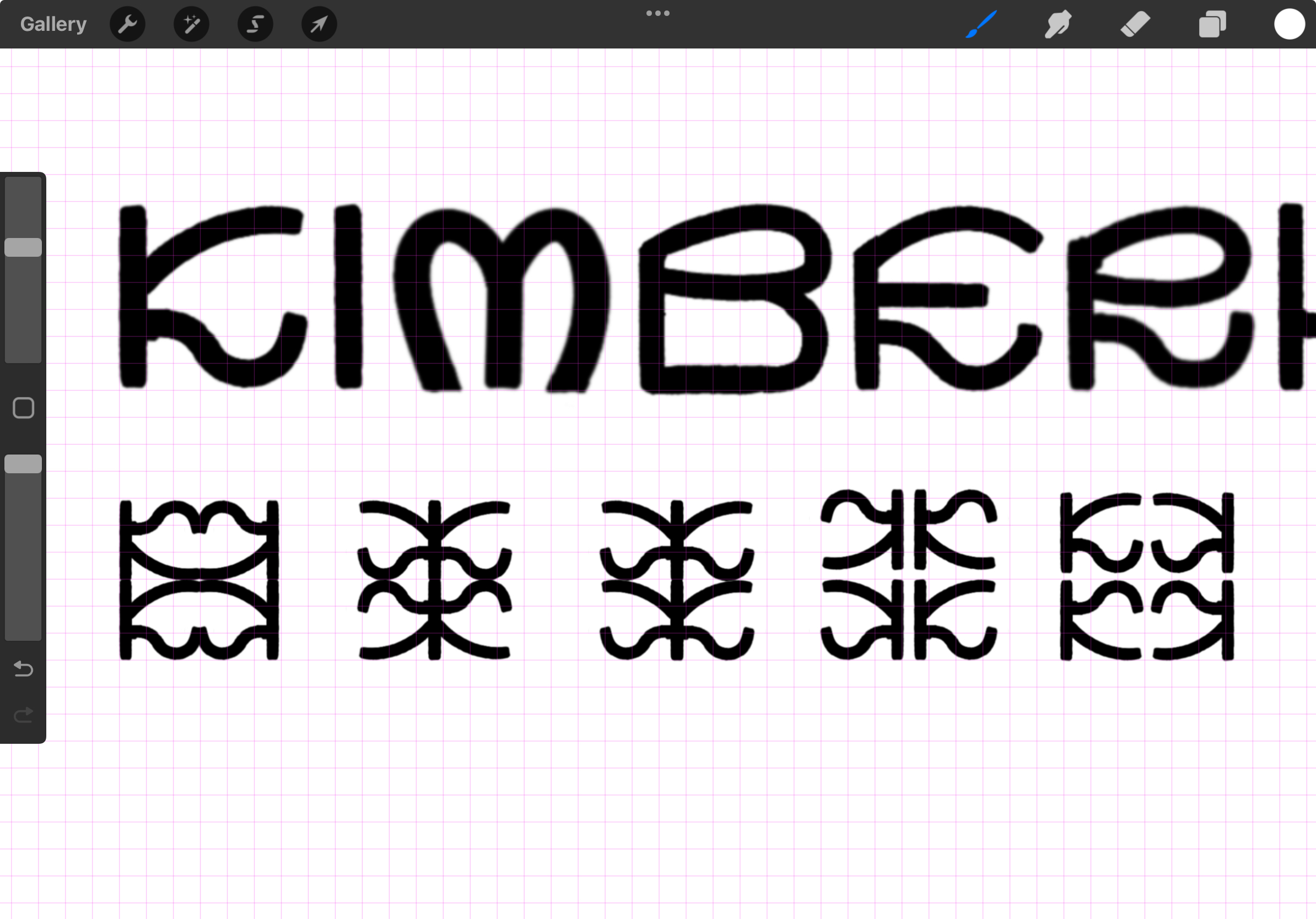
Fig. 20. Monogram Exploration

Fig. 21. Final Chosen Monogram
I decided to go with the fourth option from the left as my
final monogram.
Collateral
Mockup Websites I Used:
1.
Creastsy
3.
Resource Boy
4.
Pexels
I chose to create a t-shirt mockup, a business card mockup, and
a hardcover book mockup. I first arranged the designs in
Illustrator, then brought them into Procreate to apply them onto
the mockup templates.

Fig. 22. T-shirt, Business Card, Hardcover Book Mockup
Progress
Instagram Page
1. Colour Palette
I wanted to spice up my colour palette post, so I created
a gradient background and placed my colour palette as a
thin vertical strip on top

2. Self Portrait
For the self-portrait post, I experimented with placing both
the wordmark and monogram on the image to see what worked
best. I ended up keeping it minimal by placing the wordmark at
the centre and the monogram at the bottom right for an
editorial look. The cream colour from my palette blended too
much into the background, so I chose the light green
instead.

Fig. 24. Self Portrait Instagram Post Progress
3. Patterns
I created three designs for my patterns / miscellaneous posts.
The one on the far left is meant to showcase the typographic
design on its own. Next is the monogram placed against a plain
background. Lastly, to avoid making my Instagram page look too
plain, I designed a checkerboard pattern using the monogram
and added my wordmark at the bottom. It ended up looking like
a digital poster, which is interesting.

Final Compilation for Task 2(b)

Fig. 26. Collateral - T-shirt

Fig. 27. Collateral - Business Card


Fig. 30. Screenshot of Instagram Page
Fig. 31. Final Collateral Compilation (PDF)
Link: https://www.instagram.com/kkkkdsgn?utm_source=ig_web_button_share_sheet&igsh=MTlwZWNuYWI3NHppNg==
Task 2 Final Compilation
Fig. 32. T2A Black Wordmark on White Background
(JPEG)
Fig. 33. T2A White Wordmark on Black
Background (JPEG)
Fig. 34. T2A Colour Palette (JPEG)
Fig. 35. T2A Wordmark in Actual Colours on Lightest
Shade of Colour Palette (JPEG)
Fig. 37. T2A Final Key Artwork Compilation
(PDF)
Fig. 38. T2A Wordmark Animation (GIF)
Fig. 39. T2B Collateral - T-shirt
Fig. 40. T2B Collateral - Business Card

Fig. 42. T2B Collateral Layout

Fig. 43. T2B Screenshot of Instagram Page
Instagram Account Link: https://www.instagram.com/kkkkdsgn?utm_source=ig_web_button_share_sheet&igsh=MTlwZWNuYWI3NHppNg==
Fig. 44. T2B Final Collateral Compilation
(PDF)
[Feedback]
Week 5 (20/5/25)
General Feedback:
Task 2 (a) progress check by Mr Vinod. He suggested I continue
to explore and refine my wordmarks, add more details / make it
more minimal.
Specific Feedback:
I continued to explore & refine my wordmarks this
week.
Week 6 (27/5/25)
General Feedback:
Final digitised key artwork progress check by Mr Vinod. I did not
show my progress this week as I am still finalising my
wordmark.
Specific Feedback:
I continued to finalise my wordmark this week and begin Task
2(b).
Week 7 (3/6/25)
General Feedback:
Collateral progress check by Mr Vinod.
Specific Feedback:
Still working on refining my final wordmark and beginning
collateral part.
Week 8 (10/6/25)
General Feedback:
[Independent Learning Week] Class is conducted online this
week. Final progress check for Task 2 by Mr. Vinod.
Specific Feedback:
I continued to work on Task 2(b).
Week 9 (17/6/25)
General Feedback:
[Submission Week] [Absent for Class] We started Task 3 this
week.
Specific Feedback:
This week, I worked on finalising the entire Task 2 and
also the blog + Instagram page. I also began Task 3 to get
my concepts approved next week.
[Reflection]
Experience
Overall, this task was meticulous but fun. It required a lot
of brainstorming, looking at references, and figuring out what
direction I wanted to go with. Exploring this nature-inspired,
organic but still modern style was refreshing, but it also
took time to figure out how to balance decorative elements
with legibility. The process made me more aware of how small
changes can affect the overall vibe of the wordmark.
Observation
Creating a strong wordmark isn’t just about making it look
good, it’s about refining an idea through repeated sketching
and exploration. Each version brought me closer to a clearer
concept, and I learned to be more intentional with every
element I included.
Findings
I’ve learned that understanding the meaning behind your design
is just as important as knowing how to present it visually. A
wordmark shouldn’t just look good, it should carry the essence
or soul of what it represents. Being able to incorporate that
into the form makes the final result feel more intentional and
personal. It’s about reflecting your values or identity in a way
that feels subtle, but strong.
[Further Readings]
Logos That Lasts by Allan Peters

Chapter 1: What Makes a Logo Lasts?
Key Factors Affecting Logo Longevity
1. Time: Logos grow stronger and more memorable over time.2. Marketing Budget: A strong budget facilitates repeat viewings for better memory embedding.
3. Product Quality: A logo's effectiveness is tied to the quality of the represented product.
Seven Controllable Factors for Logo Design
1. Personal Passion: Passionate designers create more impactful logos.2. Universal Beauty: Logos should resonate with a broad audience.
3. Originality: Balance simplicity with uniqueness to stand out.
4. Functionality: Logos need to be recognizable across various applications.
5. Colour Palette: Colour should convey the logo’s story and differentiate it.
5. Story: Integrating storytelling elements enhances brand recall.
6. Simplicity: Keep it simple while maintaining beauty and impact.
Chapter 2: Brand Mark Process
Logo Design Steps
1. Brand Noun Process: Identify relevant nouns to represent the brand.2. Sketch Phase: Create 50+ rough sketches to explore diverse ideas.
3. Combining Brand Nouns: Merge multiple nouns to form unique marks using various design techniques.
4. Vectorizing & Gridding: Digitally refine sketches ensuring simplicity and effective negative space.
5. Brand Mark Exploration: Select top three marks and develop them into comprehensive brand systems.
6. First-Round Brand Mark Presentation: Present 15 monochromatic logo options for discussion and feedback.
7. Revisions & Client Guidance: Constructively address client feedback to strengthen the design.
8. How to Sell a Strong Mark: Position yourself as an expert and collaborate with clients to enhance design quality.


Comments
Post a Comment