Design Principles | Task 3: Development & Design
3/2/25 - 28/2/25 (Week 5 - Week 7)
Kimberly Miaw Jya Nee | 0366836
Bachelor of Design (Honours) in Creative Media | Taylor's University
Design Principles
Task 3: Development & Design (30%)
[Tables of Contents]
1.
Lectures
2.
Instructions
3.
Task
4.
Feedback
5.
Reflection
6.
Quick Links
[Lectures]
- No Lectures -
[Instructions]
[Task]
For our final task, we were required to create an artwork based on one of
the sketches we did in Task 2. We have to further develop our chosen
sketch through colour exploration, composition, typeface, positioning,
etc., with design principles in mind.
Format & Requirements:
Size: A4 File Type: JPEG (min. 300dpi pixel size)
Label: <Your Name_Title of Design_Task 3>

Fig. 1. 1899, The Water Lily Pond, Claude Monet
Title: The Water Lily Pond
Artist: Claude Monet
Year: 1899
Size: 93 cm x 74 cm
Medium: Oil paint on canvas
Figure 2 below is my second sketch that I made in Task 2 that was chosen by
Mr. Vinod for me to proceed with. This sketch is a submerged underwater view where the image looks like it was taken underwater, which has visible lily
roots, fishes, and ripples of light from above. The bridge would be
slightly distorted by the refraction of light in water which gives it a
dreamy, surreal effect. This version would focus on texture and transparency
which emphasizes how light interacts below the surface.

Fig. 2. Sketch #2 from
Task 2
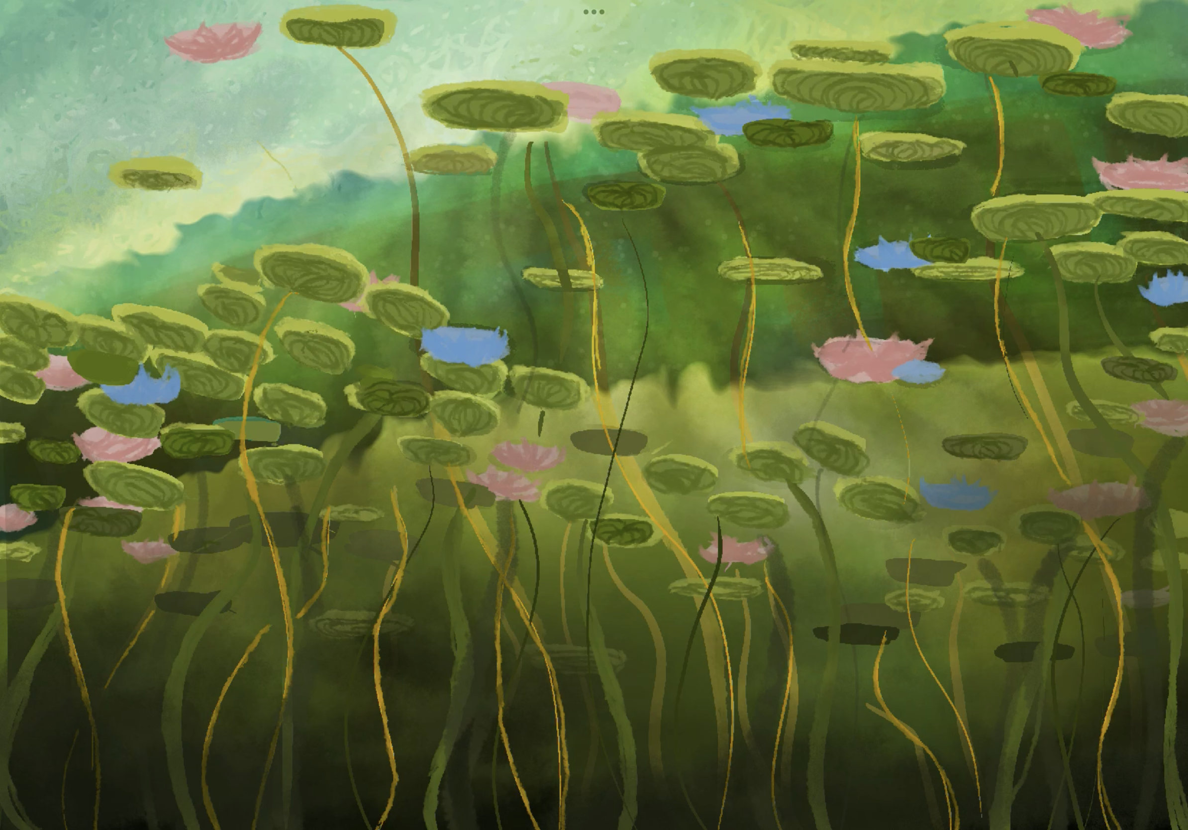
For our final task, I refined my sketch further and adjusted it to the
required A4 format. During the last consultation in Week 7, Mr Vinod gave feedback that my
composition is already good, but the artwork just needs a focal point, more texture, and more vibrant
colours, similar to the original painting. He also suggested adding a
reflection of the underside of the bridge if there is enough time.
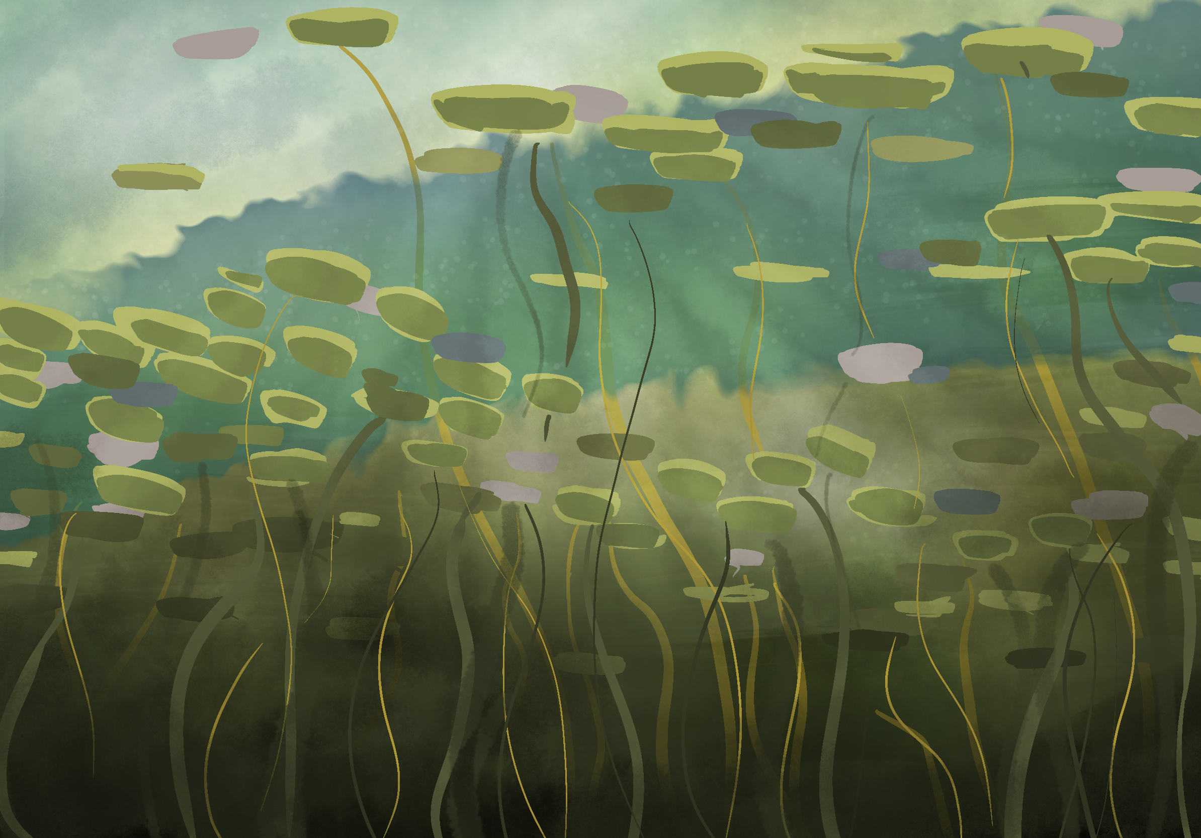
Fig. 3. Refined Sketch #2
First, I increased the saturation for each layer. Then, I used a textured
brush to roughen up the edges of the water lilies, their roots, and the
sky to enhance the painterly feel.

Next, I added details to the underside of the lily pads and the water
lilies. I also created a shadow beneath the bridge to add depth.
I added back the light rays, and created a double layer to make them more
prominent. I experimented with different blending modes to achieve an
almost iridescent effect. Additionally, I incorporated more light blues
into the middle of the composition to better reflect the sky.
Fig. 7. Process of Final Artwork #3
Lastly, I highlighted the colours of the lily pads in the centre of the composition, adding more depth and contrast. I also darkened the bottom of the pond and incorporated additional texture. At this stage, most of the adjustments focused on refining colours and enhancing the overall balance before the final touches.

Fig. 8. Process of Final Artwork #4
For the final touch, I adjusted the hue and saturation of the reds,
greens, and blues in Lightroom as I found them a little too vibrant compared to
the original painting.

Fig. 10. Final Artwork (PDF) - <Kimberly Miaw Jya Nee_Beneath Monet's Bridge_Task
3>
Title: Beneath Monet's Bridge
Rationale:
i) The decisions made in your design.
For this piece, I aimed to reimagine Monet’s The Water Lily Pond from a different perspective, which focuses on depth, light, and colour. Rather than emphasizing the bridge, I shifted the focus to the lily pads, particularly their underside, which is often overlooked. I wanted to show how they interact with the light filtering through the water while creating a sense of depth and layering. The bridge remains in the background, slightly blurred, serving more as a framing element rather than the focal point.
ii) The meaning / purpose of the design.
- The composition is structured to guide the viewer’s eye upward and toward the right side which also creates a natural sense of movement.
- Light and color play an important role in adding depth, with subtle adjustments to saturation and blending modes used to create an iridescent effect.
- The lily pads and their undersides were given more detail and texture to emphasize their presence in the foreground, contrasting against the softer background.
iii) The design principles that are employed to create the
design.
1. Gestalt Theory
(a) Principle of Figure Ground
- The lily pads serve as the dominant figure, standing out against the softer background elements like the bridge and pond.
(b) Principle of Close Proximity
- The water lilies are placed close together, which created a sense of unity in the pond
2. Balance
(a) Asymmetrical Balance
- Although both sides of the composition feature water lilies, they are arranged at a slant, which creates a sense of visual balance without perfect symmetry.
(b) Rule of Thirds
- The composition is divided into three sections: the top and middle feature the bridge and water lilies, while the bottom showcases the roots. This creates a structured yet dynamic visual hierarchy.
3. Movement
- The arrangement of the water lilies naturally guides the viewer’s eye through the composition, while the blurred bridge subtly suggests the gentle movement of water.
4. Harmony & Unity
- A cohesive colour palette and consistent lighting tie the composition together.
5. Rhythm
- The repetition and directional flow of elements guide the viewer’s eye naturally across the artwork, creating a sense of rhythm.
[Feedback]
Week 5 (3/3/25)
General Feedback:
Started Task 3.
Specific Feedback:
This week, I spent my time understanding and digesting the brief for Task
3. Mr. Vinod has suggested me to proceed with Sketch #2, so I decided to
further refine my sketch before rendering the final artwork.
Week 6 (10/3/25)
General Feedback:
Progress check by Mr. Vinod during tutorial. I don't have much progress to
show him this week. Sir suggested I try to add more outline details
/ highlight certain details, but still keep it in impressionism
style.
Specific Feedback:
I need to work faster and catch up with the progress before next week's
last consultation.
Week 7 (17/3/25)
General Feedback:
[Submission Week] Last progress check by Mr. Vinod during the tutorial. At
that moment, I only had the refined sketch to show. This week, I mainly
worked on Task 3 and the final compilation blog.
Specific Feedback:
Mr. Vinod mentioned that the composition is fine. The artwork just needs
a focal point, more texture, and more vibrant colours, similar to the
original painting. He also suggested adding a reflection of the underside
of the bridge if possible.
[Reflection]
Experience
Overall, I found the final task just as enjoyable as the first two. It was
quite straightforward since I only had to render my chosen sketch from
Task 2. The most time-consuming part was refining the sketch, as I had to
visualize the details while referencing underwater photos of a lake or
pond. The rest of the process was mostly trial and error, which was
experimenting with colours and brush strokes.
Observation
To accurately express our interpretation or recreation of an artwork, we
need to understand its composition beyond just the design principles used.
This includes considering the medium and techniques applied, as they play
a important role in shaping the overall visual impact.
Findings
Through this task, I realized how much perspective and composition can
influence the overall mood and storytelling of an artwork. By
experimenting with different angles, I was able to shift the focus of the
scene and highlight different elements. I also found that refining
details, such as textures and reflections, adds depth and makes the piece
feel more immersive. Lastly, I learned that trial and error is a big part
of the process sometimes, unexpected choices can lead to better
results.
Thank You


Comments
Post a Comment