23/9/24 - 28/10/24 (Week 1 - Week 6)
Kimberly Miaw Jya Nee | 0366836
Bachelor of Design (Honours) in Creative Media | Taylor's University
Typography
Task 1: Exercises (20%)
[Table of Contents]
[Lectures]
Week 1: Introduction to Typography
Assignment:
Task 1: Exercises (20%)
Task 2: Typographic Exploration & Communication [Text Formatting
and Expression] (20%)
Task 3: Type Design & Communication (30%)
Task 4: E-portfolio (30%)
Typo_0_Introduction
What is Typography?
-
The act of creating letters
-
The creation of type faces / family
-
The style and appearance of printed matter - Oxford dictionaries
-
The art and technique of arranging type to make written language
legible, readable, and appealing when displayed. The arrangement of type
involves selecting typefaces, point size, line length, line-spacing
(leading), letter-spacing (tracking), and adjusting the space within
letters pairs (kerning). The term typography is also applied to the
style, arrangement, and appearance of the letters, numbers, and symbols
created by the process. - Wikipedia
Typography has evolved over 500 years:
Calligraphy > Lettering > Typography
"Any discipline would benefit from the understanding of typography
because it has a bearing on the way you present yourself, your
information, and how you communicate effectively."
Font
-
Refers to the individual font / weight within the typeface
-
Example: Georgia Regular, Georgia Italic, Georgia Bold
Typeface
-
Refers to the entire family of fonts/weights that share similar
characteristics/styles
-
Example: Georgia, Arial, Times New Roman, Didot, Futura
Typo_1_Development
Early Letterform Development: Phoenician to Roman
Fig. 1.
Phoenicians / Semitic (Middle East)
-
Wrote from right to left.
Greek
-
Developed a writing style called boustrophedon ("how the ox
ploughs"), where lines alternated direction, reading from right to left
and then left to right.
-
Changed the orientation of letterforms when changing direction.
-
Similar to the Phoenicians, did not use letter spacing or
punctuation.
Etruscan (and then Roman)
-
Carvers working in marble painted letterforms before inscribing
them.
-
Certain stroke qualities like weight changes from vertical to horizontal
and broadening at the start and end of strokes were carried over into the
carved letterforms.
Fig. 2.
Text Type Classification Chronological Timeline
1450 Blackletter
1475 Oldstyle
1500 Italic
1550 Script
1750 Transitional
1775 Modern
1825 Square Serif / Slab Serif
1900 Sans Serif
1990 Serif / Sans Serif
Week 2: Text [Part 1]
Typo_3_Text P1
Text: Kerning and Letterspacing
Kerning (option + left/right arrow)
- Refers to the automatic adjustments of space between letters
Tracking
- The addition and removal of space in a word or sentence
Letterspacing (option + right arrow key)
- To add space between the letters
Text: Formatting Text
Fig. 3. Text Alignments
Flush Left
-
This format most closely mirrors the asymmetrical experience of
handwriting.
-
Each line starts at the same point but ends wherever the last word on
the line ends.
-
Spaces between words are consistent throughout the text, allowing the
type to create an even grey value (text on white page)
Centered
-
This format imposes symmetry upon the text, assigning equal value and
weight to both ends of any line.
-
It transforms fields of text into shapes, thereby adding a pictorial
quality to material that is non-pictorial by nature.
-
Because centered type creates such a strong shape on the page, its
important to amend line breaks so that the text does not appear too
jagged.
Flush Right
-
The format places emphasis on the end of a line as opposed to its
start.
-
It can be useful situations (like captions) where the relationship
between text an image might be ambiguous without a strong orientation to
the right
Justified
-
Like centering, this format imposes a symmetrical shape on the text. It
is achieved by expanding or reducing spaces between words and,
sometimes, between letters.
-
The resulting openness of lines can occasionally produce 'rivers'
(gaps) of white space running vertically through the text.
-
Careful attention to line breaks and hyphenation is required to amend
this problem whenever possible.
Text: Texture
Fig. 4. Anatomy of Typeface
-
Type with a relatively generous x-height or relatively heavy stroke
width produces a darker mass on the page than type with a relatively
smaller x-height or lighter stroke.
-
Sensitivity to these differences in colour is fundamental for creating
successful layouts.
Text: Leading & Line Length
Type size
-
Text type should be large enough to be read easily at arms length—imagine
yourself holding a book in your lap.
Leading
-
Text that is set too tightly encourages vertical eye movement; a reader
can easily loose his or her place.
-
Type that is set too loosely creates striped patterns that distract the
reader from the material at hand.
Line Length
-
Appropriate leading for text is as much a function of the line length as
it is a question of type size and leading.
-
Shorter lines require less leading; longer lines more.
-
A good rule of thumb is to keep line length between 55-65 characters.
Extremely long or short lines lengths impairs reading
- Decide type size
-
Determine the leading (Generally 2-3 point larger than point size)
- Determine line length
Text: Text Specimen Book
Fig. 5. Text Specimen Book
A type specimen book (or ebook for screen) is to provide an accurate
reference for type, type size, type leading, type line length etc.
Week 3: Text [Part 2]
Typo_4_Text P2
Text: Indicating Paragraph
Several options for indicating paragraphs.
1. 'Pilcrow', a holdover from medieval manuscripts seldom use today.
Fig. 6. Pilcrow
The example here displays a 'line space' (leading*) between the
paragraphs. Hence if the line space is 12pt, then the paragraph space is
12pt. This ensures cross-alignment across columns of text.
Fig. 7. Line Space Between Paragraphs
Line Space vs Leading
Fig. 8. Line Space vs Leading
3. Indentation
Fig. 9. Paragraph Indentation
The indent is the same size of the line spacing or the same as the point
size of your text.
4. Extended paragraph
Fig. 10. Extended Paragraph
The method of extended paragraphs below creates unusually wide columns
of text. Despite these problems, there can be strong compositional or
functional reasons for choosing it.
Text: Widows & Orphans
Fig. 11. Widows & Orphans in Text
In traditional typesetting (the kind that still endures among
conscientious commercial publishers), there are two unpardonable
gaffes—widows and orphans. Designers (specifically those that deal with
large amounts of text in websites or books on online magazines or
printed magazines, news papers or online journals) must take great care
to avoid the occurrence of the the above mentioned.
Widow
- A short line of type left alone at the end of a column of text.
Orphan
- A short line of type left alone at the start of new column.
In justified text both widows and orphans are considered serious gaffes.
Flush right and ragged left text is somewhat more forgiving towards
widows, but only a bit. Orphans remain unpardonable.
The only solution to widows is to rebreak your line endings through out
your paragraph so that the last line of any paragraph is not noticeably
short.
Orphans, you might expect, require more care. Careful typographers make
sure that no column of text starts with the last line of the preceding
paragraph.
Text: Highlighting Text
The following are some simple examples of how to highlight text within a
column of text. Different kinds of emphasis require different kinds of
contrast.
- Italics
- Bold
- Bold + Change Typeface (need to adjust font size)
- Colour
-
Placing a field of colour at the back of the text (maintain the left
reading axis of the text to ensure readability is at its best.)
- Bullet points
- Quotations marks
Text: Headline within Text
Fig. 12. 3 Different Examples of Headlines
A head indicates a clear break between the topics within a
section.
There are many kinds of subdivision within text of a chapters. In the
following visuals these have been labeled (A, B and C) according to the
level of importance.
Putting together a sequence of subheads = hierarchy. There is no single
way to express hierarchy within text; in fact the possibilities are
virtually limitless.
Text: Cross Alignment
Fig. 13. Text Cross Alignment
Cross aligning headlines and captions with text type reinforces the
architectural sense of the page—the structure—-while articulating the
complimentary vertical rhythms. In this example, four lines of caption
type (leaded 9 pts.) cross-align with three lines of text type (leaded
to 13.5pts).
Week 4: Typography Basic
Typo_2_Basic
Basic: Describing Letterforms
Fig. 14. Describing Letterforms
Baseline: The imaginary line the visual base of the letterforms.
Median: The imaginary line defining the x-height of letterforms.
X-height: The height in any typeface of the lowercase 'x'.
Stroke: Any line that defines the basic letterform
Apex / Vertex: the point created by joining two diagonal stems (apex above and vertex
below)
Arm: Short strokes off the stem of the letterform, either horizontal (E, F, L)
or inclined upward (K, Y).
Ascender: The portion of the stem of a lowercase letterform that projects above the
median.
Barb: The half-serif finish on some curved stroke.
Beak: The half-serif finish on some horizontal arms.
Bowl: The rounded form that describes a counter. The bowl may be either open or
closed.
Bracket: The transition between the serif and the stem.
Cross Bar: The horizontal stroke in a letterform that joins two stems together
Cross Stroke: The horizontal stroke in a letterform that joins two stems
together.
Crotch: The interior space where two strokes meet
Descender: The portion of the stem of a lowercase letterform that projects below the
baseline
Ear: The stroke extending out from the main stem or body of the letterform
Em/En: Originally referring to the width of an uppercase M, and em is now the
distance equal to the size of the typeface (an em in 48 points, for
example). An en is half the size of an em. Most often used to describe em/en
spaces and em/en dashes.
Finial: The rounded non-serif terminal to a stroke.
Leg: Short stroke off the stem of the letterform, either at the bottom of the
stroke (L) or inclined downward (K, R).
Ligature: The character formed by the combination of two or more letterforms.
Link: The stroke that connects the bowl and the loop of a lowercase G.
Loop: In some typefaces, the bowl created in the descender of the lowercase
G.
Serif: The right-angled or oblique foot at the end of the stroke.
Shoulder: The curved stroke that is not part of a bowl
Spine: The curved stem of the S
Spur: The extension the articulates the junction of the curved and rectilinear
stroke.
Stem: The significant vertical or oblique stroke
Stress: The orientation of the letterform, indicated by the thin stroke in round
forms
Swash: The flourish that extends the stroke of the letterform
Tail: The curved diagonal stroke at the finish of certain letterforms
Terminal: The self-contained finish of a stroke without a serif. This is something of
a catch-all term. Terminals may be flat (T' above), flared, acute, ('t'
above), grave, concave, convex, or rounded as a ball or a teardrop (see
finial).
[Instructions]
[Process Work]
Type Expression
For our first exercise in this task, we were given 4 words to compose and
express. We had chosen Burn, Melt, Fade, and Grow.
This task has to be done in black and white, and we can’t use visual
elements or drawings unless specifically approved. However, we can
incorporate minor graphic details, like lines, dots, or shading, where
needed. Lastly, we’re only allowed to use the 10 typefaces provided.
-
ITC New Baskerville Std
-
Janson Text LT Std
-
Gill Sans Std
-
Bembo Std
-
Serifa Std
-
Bodoni Std
-
Futura Std
-
Univers LT Std
-
ITC Garamond Std
-
Adobe Caslon Pro
Research
I decided to explore Pinterest for inspiration and to get a rough idea of
my direction for the chosen words. Here are some pieces that stood out to
me and served as inspiration for my own work.
Fig. 15. Reference Pictures for Type Expression
Ideation
Sketches - Burn, Melt, Fade, Grow
We had to create at least four sketches for each word. I have to admit,
I felt a bit stuck during this stage, as my ideas seemed too basic and
didn’t fully express what I wanted to convey. Nonetheless, I shared
these sketches with Mr. Max, and he selected a few that I can develop
further (marked with a brown star).
Fig. 16. Sketches for Burn, Melt, Fade, and Grow
These are some initial explorations I've done in Illustrator as a warm-up.
Just some ideas I wanted to try out.
Fig. 17. Explorations of Burn, Melt, Fade, Grow
Digitalisation
Fig. 18. Digitalisation for Burn, Fade, Melt, Grow in Illustrator
Burn
I wasn't satisfied with my initial sketch, so I came up with a new
concept focused on creating a burnt paper effect. I played around with the
effects tab until the word looked like a burnt piece of paper.
Fig. 19. Effects Used for Burn
Melt
My exploration for melt was actually my first draft, but it got rejected
since it used too much distortion. I decided to go simple and make the words
look like they're slowly melting, such as tilting the letters E, L, and T. I
also added a 'puddle' at the bottom of the words, rounded the corners, and
as a finishing touch, I added a glow on the top part of the words to make it
seem like they were already melted.
Fig. 20. Effects Used for Melt
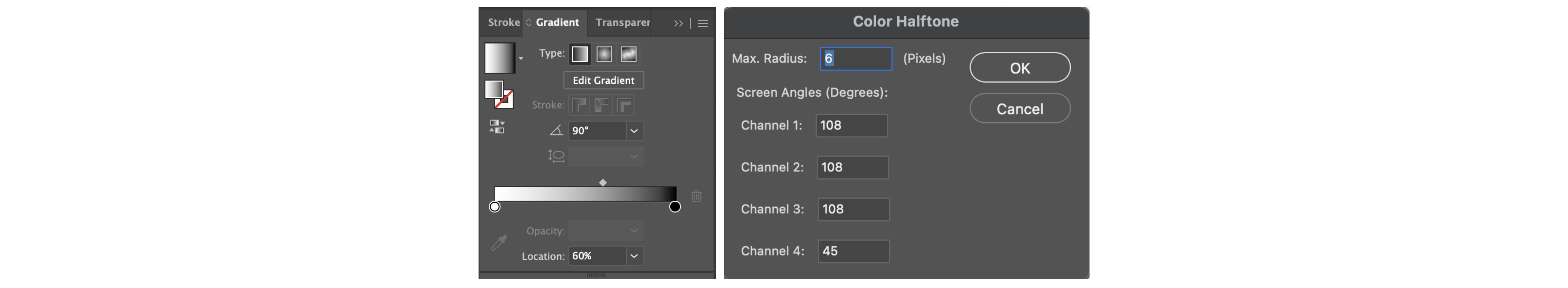
Fade
I liked the design from my exploration but decided to revisit the original
concept based on my sketch. Initially, the faded areas of the word were
gray. After Mr. Max advised me to enhance the design further, I incorporated
a gradient and halftone effect to add more depth and visual interest.
Figs. 21. Effects Used for Fade
Grow
This design is the simplest among the others. The letter G is shaped like
an upward-pointing arrow, while the remaining letters gradually increase
in size as they move upward.
Final Outcome
Fig. 22. Final Type Expression (JPEG)
Fig. 23. Final Type Expression (PDF)
Type Expression: Animation
For the second exercise, we had to pick a word from our 4 type
expressions to create a GIF animation. I went with ‘Burn.’ My
concept is to create the effect of paper burning from the centre,
gradually turning the entire word black.
First, I created the frames in Illustrator. I found that 10 frames
were just right for my animation.
Fig. 24. Animation Frames in Illustator
Then, I moved the frames into Photoshop to set up the animation and
adjust the timing for each frame in the Timeline Panel.
Fig. 25. Animation Timeline in Photoshop
Final Outcome
Fig. 26. GIF Animation of Burn
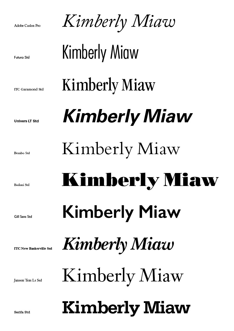
Text Formatting: Kerning & Tracking
Our next exercise required us to use InDesign for a kerning and
tracking exercise, adjusting our own names in the 10 provided fonts.
This exercise was quicker and simpler compared to the others. We
completed it during our Week 5 practical session, guided by Mr.
Max.
Fig. 27. My Name in 10 Different Fonts, After Kerning &
Tracking (JPEG)
Text Formatting: Layout
Our final exercise for Task 1 is creating text layouts, using
InDesign too. We needed to come up with six different layouts for
Mr. Max to review and finalize. Below are some layout inspirations I
came across on Pinterest.
Fig. 28. Layout Inspiration Pictures from
Pinterest
Fig. 29. 6 Text Layouts (JPEG)
Formatting Details
HEAD LINE
Typeface: Bembo Std
Font/s: Bembo Std Bold
Type Size/s: 72 pt
Leading: 36 pt
Paragraph spacing: 0
BODY
Typeface: Bembo Std
Font/s: Bembo Std
Type Size/s: 9 pt
Leading: 11 pt
Paragraph spacing: 11 pt
Characters per-line: 57
Alignment: left justified
Margins: 123 mm top, 26 mm left + right + bottom
Columns: 2
Gutter: 10 mm
Final Outcome
Fig. 30. Text Formatting Layout - Without Grid (PDF)
Fig. 31. Text Formatting Layout - With Grid (PDF)
[Feedback]
Week 1 (23/9/24)
General Feedback:
Introduction to Typography module, we set up our e-blog using
blogger.
Week 2 (30/9/24)
General Feedback:
Introduction to Adobe Illustrator. Mr Max shared some useful
shortcut keys for Illustrator. Still working on my sketches this
week, I have only done sketches for Burn and Grow.
Week 3 (7/10/24)
General Feedback:
This week I showed my sketches for all 4 words to Mr Max, he
has chosen one design from each word for me to proceed with
digitalisation in Illustrator.
Specific Feedback:
I felt that my ideas for Burn and Melt could be better so I
decided to do some explorations in Illustrator.
Week 4 (14/10/24)
General Feedback:
Finally done with digitalisation for all 4 words.
Specific Feedback:
I've shown the final 4 words to Mr Max, he suggested to
change "melt" because it was too distorted which is not
recommended for this task.
Week 5 (21/10/24)
General Feedback:
Still working on my animation for the word 'Burn'.
We did 2 text formatting exercises during practical, guided by Mr
Max. Both of these exercise were done in Adobe Indesign. For the
Text Formatting - Layout we had to come up with 6 drafts for Mr
Max to choose.
Week 6 (28/10/24)
General Feedback:
Finally done with my 'Burn' animation and the 6 layouts for the
text formatting exercise. This week I mainly worked on updating
the blog.
[Reflection]
Experience
Typography, so far, has been an enjoyable module. While it
can be challenging at times, the satisfying outcome of my Task
1 makes it all worthwhile. I believe this task is an excellent
way for us students to gain insight into what Typography truly
is.
Observation
The restrictions for this task encouraged me to think
creatively. I’ve come to appreciate that simplicity isn’t
always a drawback; at times, it allows the message to take
center stage. As Mr. Vinod mentioned, the goal is to ensure
that people read the word first instead of focusing on the
design, or something along those lines, which emphasizes the
importance of subtlety in typography.
Findings
I realized that typography is far more meticulous than I’d
imagined. I already knew it required attention to detail, but
I didn’t expect it to be this precise. Every element is
carefully considered and planned, down to the smallest
adjustments that most people might overlook, like avoiding
'rivers' in text. It’s impressive how these subtle tweaks
shape the entire feel and readability of a design.
[Further Readings]
Fig. 32. Thinking with Type by Ellen Lupton
Thinking with Type is not a book about fonts. It is book on how to use them. It is assembled in three sections: LETTER, TEXT, and GRID, building from the basic atom of the letterform to the 'organisation of words into coherent bodies and flexible systems.
LETTER | Page 12
Fig. 33. TYPE, SPACES, AND LEADS Diagram from book, 1917 Author: Frank S. Henry
In a traditional printing shop, gridded cases hold fonts of type and spacing material. Capital letters are stored in a drawer above the minuscule letters. Hence, the term "uppercase" and "lowercase" are derived from the physical space of the print shop.
LETTER | Page 37
Size
Fig. 34. Typefaces Comparison
When two typefaces are set in the same point size, one often looks bigger than the other. Differences in x-height, line weight, and character width affect the letters' apparent scale.
LETTER | Page 42
Type Classification
A basic system for classifying typefaces was devised in the 19th century, when printers sought to identify a heritage for their own craft analogous to that of art history.
Humanist letterforms are closely connected to calligraphy and the movement of the hand.
Transitional and modern typefaces are more abstract and less organic.
LETTER | Page 53
Logotypes
Logotypes use typography or lettering to depict the name of an organisation in a memorable way. Whereas some trademarks consist of an abstract symbol or a pictorial icon, a logotype uses letters to create a distinctive visual image.
A logotypes can be built with existing fonts or custom-drawn letterforms. Modern logotypes are often designed in different versions for use in different situations. A logotype is part of an overall identity program, which the designer conceives as a "language" that lives (and changes) in various circumstances.
Fig. 36. Logo of Rachel Comey, Logotypes,2003
Designer: Anton Ginzburg
These logotypes for a fashion designer use traditional letterforms in a contemporary manner. Writing the designer's name in lowercase letters softens the formality of the classic script characters, white the capital letter M in "come" injects the name with an element of surprise.
Fig. 37. Logo of THE NOGUCHI MUSUEM, Logotypes,2004
Designer: Abbot Miller and Jeremy Hoffman, Pentagram
The sides of a square have been gently contoured in reference to the work of Isamu Noguchi, namesake of the Noguchi Museum. The concave square coordinates with the typeface Balance, used in the logotype which also had softly curved elements.
LETTER | Page 57
Bitmap Fonts
Bitmap fonts are built out of the pixels (picture elements) that structure a screen display. Whereas a PostScript letter consists of a vectorized outline, a bitmap character contains a fixed number of rectilinear units that are either "on" or "off."
Outline fonts are scalable, meaning that they can be reproduced in a high-resolution medium such as print at nearly any size. Outline fonts are often hard to read on screen at small sizes, however, where all characters are translated into pixels. In a bitmap font, the pixels do not melt away as the letters get bigger. Some designers like to exploit this effect, which calls attention to the letters' digital geometry. Pixel fonts are widely used in both print and digital media.
A bitmap font is designer to be used at a specific size, such as 8 pixels, because its body is precisely constructed out of screen units. A bitmap font should be displayed on screen in even multiples of its root size (enlarge 8-px type to 16, 24, 32, and so on)
TEXT | Page 63
Although many books define the purpose of typography as enhancing the readability of the written word, one of the design's most humane function is, in actually, to help readers avoid reading.
Thank You


 Fig. 3. Text Alignments


 Fig. 15. Reference Pictures for Type Expression


Comments
Post a Comment