Digital Photography & Imaging | Project 1 Progress
24/9/24 - 15/10/24 (Week 1 - Week 4)
Kimberly Miaw Jya Nee | 0366836
Bachelor of Design (Honours) in Creative Media | Taylor's University
Digital Photography & Imaging
Project 1: Exercises - Physical Collage Design & Digital Imaging (20%)
[Table of Contents]
3. P1(b): Hearst Mansion
4. P1(b): Recolouring Black and White
5.
Reflection
[P1(a): Physical Collage Design]
Week 1: Introduction & Briefing
For our first task, we had to create a physical collage based on our own
concept and story, using magazines or other printed materials. We were
then required to come up with three pre-compositions using the elements we
had selected.
Week 2: Development
Ideation
I didn’t have a specific concept in mind at first, so I scrolled
through Pinterest for inspiration and to understand the collage styles I
prefer. Below are some pieces that heavily influenced my final
outcome.
All of these pieces lean towards an abstract style, with a recurring
cosmic theme. Circles are a big part of the compositions, which reminds
me of planets or celestial bodies.
There's a mix of geometric and organic shapes, with some using torn
paper to give them a textured, layered look. I love how some of the
designs combine muted, earthy tones with pops of bright
colour.
Materials I used:
Fig. 2. Materials I Used
Watercolour Paper, Glue Tape, Ruler, Cutter, Scissors, Uniqlo
Lifewear 2024 Fall & Winter Issue,
Harper's Bazaar Malaysia March 2024 Issue
Week 3: Process
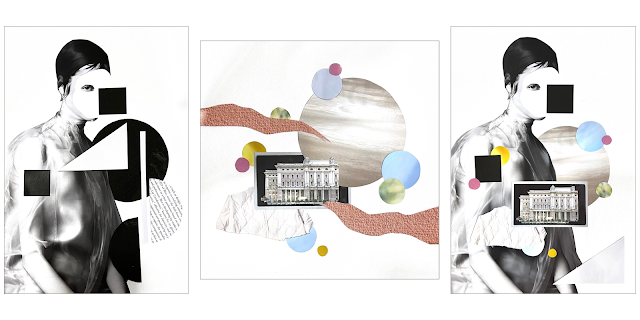
Fig. 3. Pre-composition #1, Pre- composition #2, Pre-composition #3
Pre-composition #1
For my first composition, I didn’t have a specific concept, so I
decided to experiment with geometric shapes and keep the entire design
monotone. The lady, photographed in black and white, was the first
element I had cut out. I left only one eye visible, removing the rest of
her face to give a mysterious feel.
Pre-composition #2
In the second composition, I decided to incorporate colours and created a
square collage inspired by one of my all-time favourite songs, 'Vanilla' by Sunset Rollercoaster. I’m especially happy with how it turned out,
particularly the colour palette.
Pre-composition #3
Lastly, I combined my first two pre-compositions into one, and it still
fit the theme of the song I was interpreting perfectly. The
black-and-white design, paired with small bursts of colour, made the
composition look more lively and interesting.
Week 4: Physical Collage Final Outcome
After receiving Mr Fauzi's feedback of my three compositions, he chose
Pre-composition #3 for me to finalise. He also commented that my
pre-compositions are a good series of collages.
Fig. 4. Final Physical Collage
[P1(a): Digital Imaging]
Week 4: Process
For our next task, we were required to create three digital collages using
Adobe Photoshop. We had to come up with three different compositions,
using only the set of graphics provided.
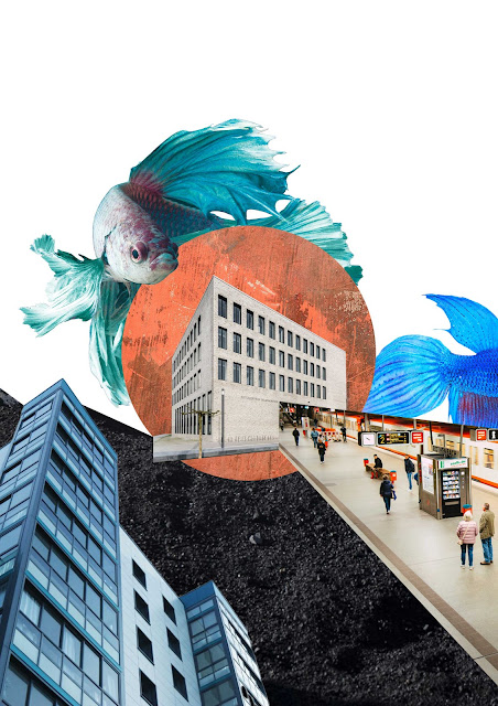
While exploring with the Pen and Marquee tool, I realized I kept
gravitating back to cosmic themes, much like the physical collages I've
created previously.
During our Week 5 online tutorial, Mr Fauzi had chosen Composition #1
as the best composition out of the three that I had made. Then, we had
to improvise our best digital collage using Adjustment Layers &
Filters in Photoshop.
Week 5: Digital Collage Final Outcome
I didn't make any major adjusments to my collage, as I think it's already
good enough. I mainly increased the brightness, contrast, and saturation
to make the entire collage more lively and vibrant. I've realized that a
small tweak can make a big difference, so I kept playing around with the
adjustments until it looked just right, which took some time.
Adjustments:
[Cyan Fish]
- Gamma Correction: +0.91
- Saturation: +14
- Shadows: +5
- Highlights: +17
[Orange Circle]
- Brightness: +3
- Contrast: +18
- Saturation: +26
[Concrete Building]
No adjustments / filters used
[Blue Building]
- Contrast: +50
[Subway Station]
No adjustments / filters used
[Cobalt Blue Fish]
- Shadows: +8
- Highlights: +5
[Black Texture Background]
- Brightness: +14
- Contrast: +60
[P1(b): Hearst Mansion
Hearst Mansion - Shazam
Final Outcome:
Hearst Mansion - My Reflection
Final Outcome:
[P1(b): Recolouring Black and White]
Part 1: Recolouring
Portrait of Norman Lindsay
Part 2: The Breakdown
Exercise 1
Final Outcome:
Fig. 10. Recoloured Image
Exercise 2
Fig. 11. Provided Image (Left) & Colour Reference Images
(Middle, Right)
Final Outcome:
Portrait of Young Queen Elizabeth
[Reflection]
The physical collage design was a fun activity to warm up our creativity while learning how to create strong compositions. Initially, I felt a bit stuck since both of my magazines were fashion magazines, which limited my visual elements. However, I'm glad I managed to come up with something I'm happy with.
Meanwhile, the digital collage assignment has really helped me improve my Photoshop skills. Even though I’ve been using the software for a few months now, I used to feel intimidated by it during my foundation year because I rarely worked with it compared to Illustrator. Now, I can confidently say that Photoshop is a pretty cool program -- it’s capable of doing so much, from editing photos, creating collages, and there’s still more for me to discover.
Thank You


Comments
Post a Comment