Digital Photography & Imaging | Week 6
28/10/24 (Week 6)
Kimberly Miaw Jya Nee | 0366836
Bachelor of Design (Honours) in Creative Media | Taylor's University
Digital Photography & Imaging
Week 6 [Lecture & Practical]: Poster Design
[Lecture]
7 Principles of Poster Design
Emphasis

Fig. 1. Emphasis in Design
- Creating a centred interest (focal point) in an art work, often achieved by colour contrast and by lines which direct the eye to it.
Balance and Alignment

Fig. 2. Balance and Alignment in Design
- How you space and place the different elements in a design so they develop a structure and feel organise and connected
Contrast

Fig. 3. Contrast in Design
- What people mean when they say a design “pops”
- It creates space and differences between elements in a design
Repetition

Fig. 4. Repetition in Design
- Unifies and strengthens a design
Proportion

Fig. 5. Proportion in Design
- Visual size and weight of elements in a composition and how they relate to each other
- Helps to approach your design in sections, instead of as a whole
Movement
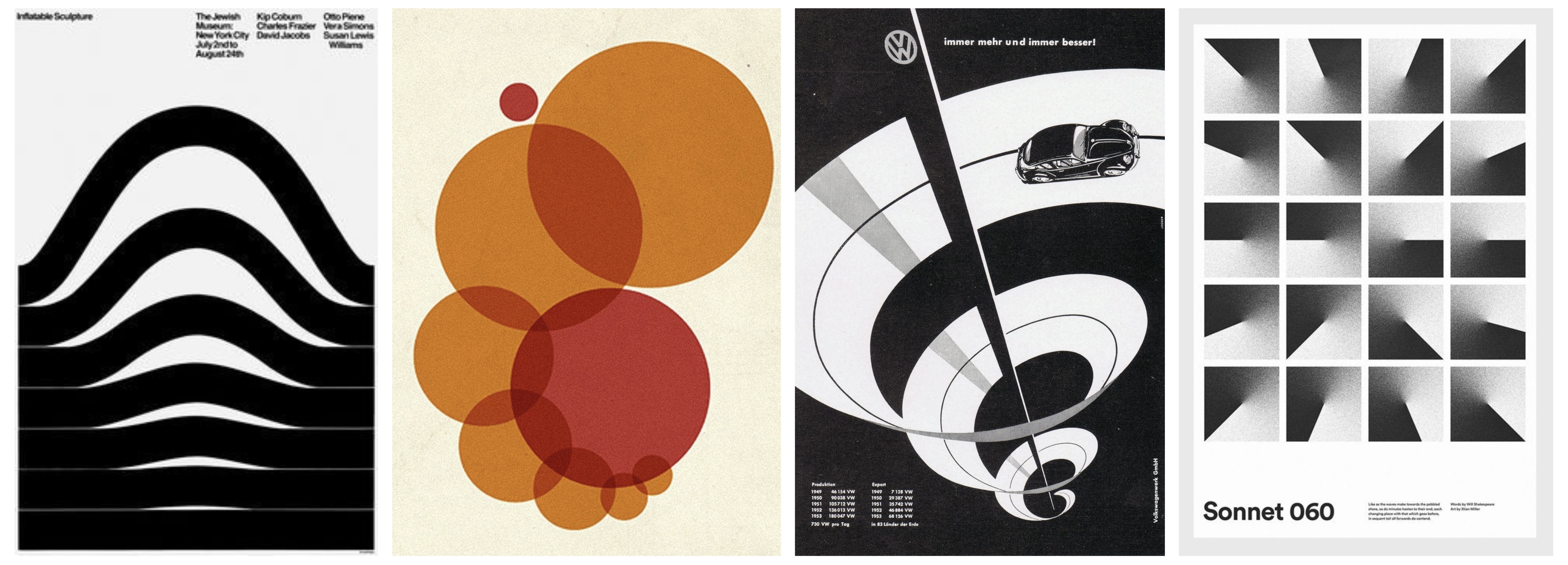
Fig. 6. Movement in Design
- Controlling the elements in a composition so that the eye is led to move from one to the next and the information is properly communicated to the audience
- Creates the story or the narrative of your work
White Space (Negative Space)

Fig. 7. White Space in Design
- Is the only one that specifically deals with what you don’t add
- The empty page around the elements in a composition
- Gives a composition more room to breathe can upgrade it from mediocre to successful
[Practical]
Project 1B - PART 02: Recolouring Black & White
Part 1: Recolouring
Portrait of Norman Lindsay

Fig. 8. Original Image (Left) & Recoloured Image (Right)
Part 2: The Breakdown
Exercise 1

Fig. 9. Provided Images (Left to Right):
B&W Portrait, Hair Colour Reference, Skin Colour Reference
Final Outcome:

Fig. 10. Recoloured Image
Exercise 2

Fig. 11. Provided Image (Left) & Colour Reference Images (Middle, Right)
Final Outcome:
Portrait of Young Queen Elizabeth

Fig. 12. Recoloured Image
Thank You


Comments
Post a Comment